

More than 50% of the world’s internet use is accessed with a mobile device. Smartphone and tablet use is increasing by the hour so having a mobile-friendly device is imperative.
If your business doesn’t have a mobile compatible website, you are likely to be losing potential customers.
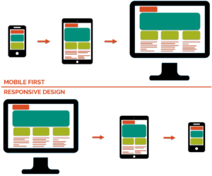
Most companies design their websites for a standard size desktop screen, then consider mobile optimisation.
At The Just Brand, we consider mobile optimisation first.
Why? Well, we know that your customers are mostly browsing your site from their smartphone, so it needs to user-friendly and being visually exciting.
If you are already considering updating your website and a high percentage of your traffic is using mobile devices then there are some things to think about.
Each design agency approaches website design projects in different ways. There’s no right way to design a mobile optimised website. However, there are certain objectives that need to be met to ensure your website is functional. You should listen to your users and keep improving your website to meet the latest trends and technology.
In order to design and develop a successful website which has lots of traffic, there are some key questions to consider and answer:
- Who is using your site?
- What are your users doing when they get to your site?
- Where is your site being accessed from?
- When is your site being accessed?
- Why are users coming to your site?
The next step is to consider design and usability. The elements that should be thought about are:
- Download speed
- This can be achieved by caching plugins
- CDN
- Optimised images
- Switch to https websites
- Simplify navigation and interactions
- Size of click targets
- No hovering
- Space between clickables
- Vertical scrolling
- How mobile forms are laid out
- Grid-based content structure with columns and rows
- Font size in points instead of pixels
- Hamburger style menu buttons
There are 2 ways to achieve mobile optimised websites. The first is a separate mobile-only website. This will have its own web address and you can design a website specifically to be shown on a small device screen. The other option is called Responsive Design. It’s a single website that alters its appearance and functionality to the screen size. This types of designs can be used on mobiles, tablets, up to large desktop screens.
Google ranks the fastest loading sites high in search results, and mobile compatibility is also a ranking signal. Making your website mobile-friendly is no longer an option, it’s absolutely necessary.
To keep users on your website, so that they make a purchase, a successful user interface (UI) is the priority, making the user experience (UX) simple and attractive will mean they will come back when they similar services again.
In order to make sure the UI and UX are seamless and trouble free, testing the website on all browser, devices and screen sizes are key. There are many emulators you can use in order to assist you with this, however, nothing can replace testing for yourself. Testing on Android, iOS and the most popular browsers (Google Chrome, Safari and Mozilla Firefox for example) is invaluable for making sure everything is working correctly and looks the way it should.
Contact us if you would like to discuss how you can make your website more responsive and user friendly across all device.